About Me
Work
Writing
About Me
Work
Writing
Anisa Chandra Kharimah
Exploring NYC’s Smoke-Free Breakfast & Brunch Spots
You may also like
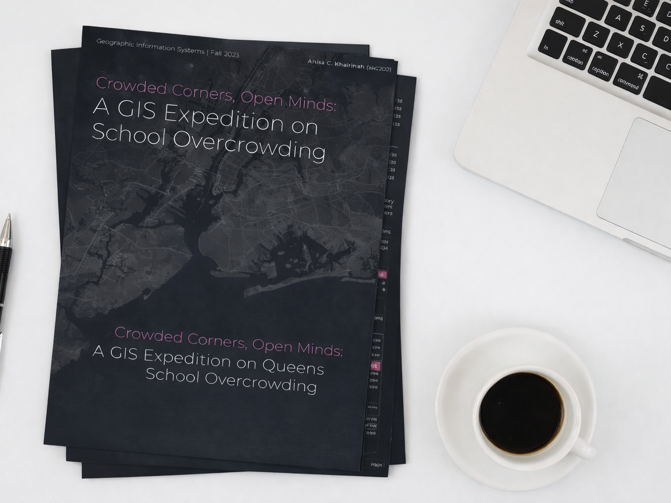
A GIS Expedition on Queens School Overcrowding
2023
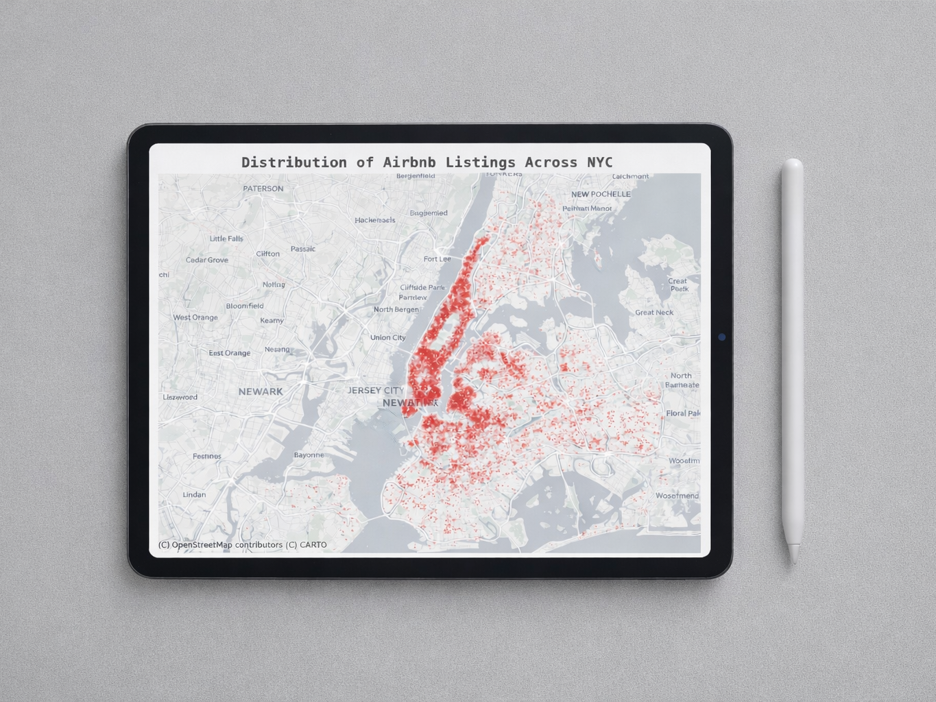
Airbnb’s Impact on Rental Affordability in NYC
2024
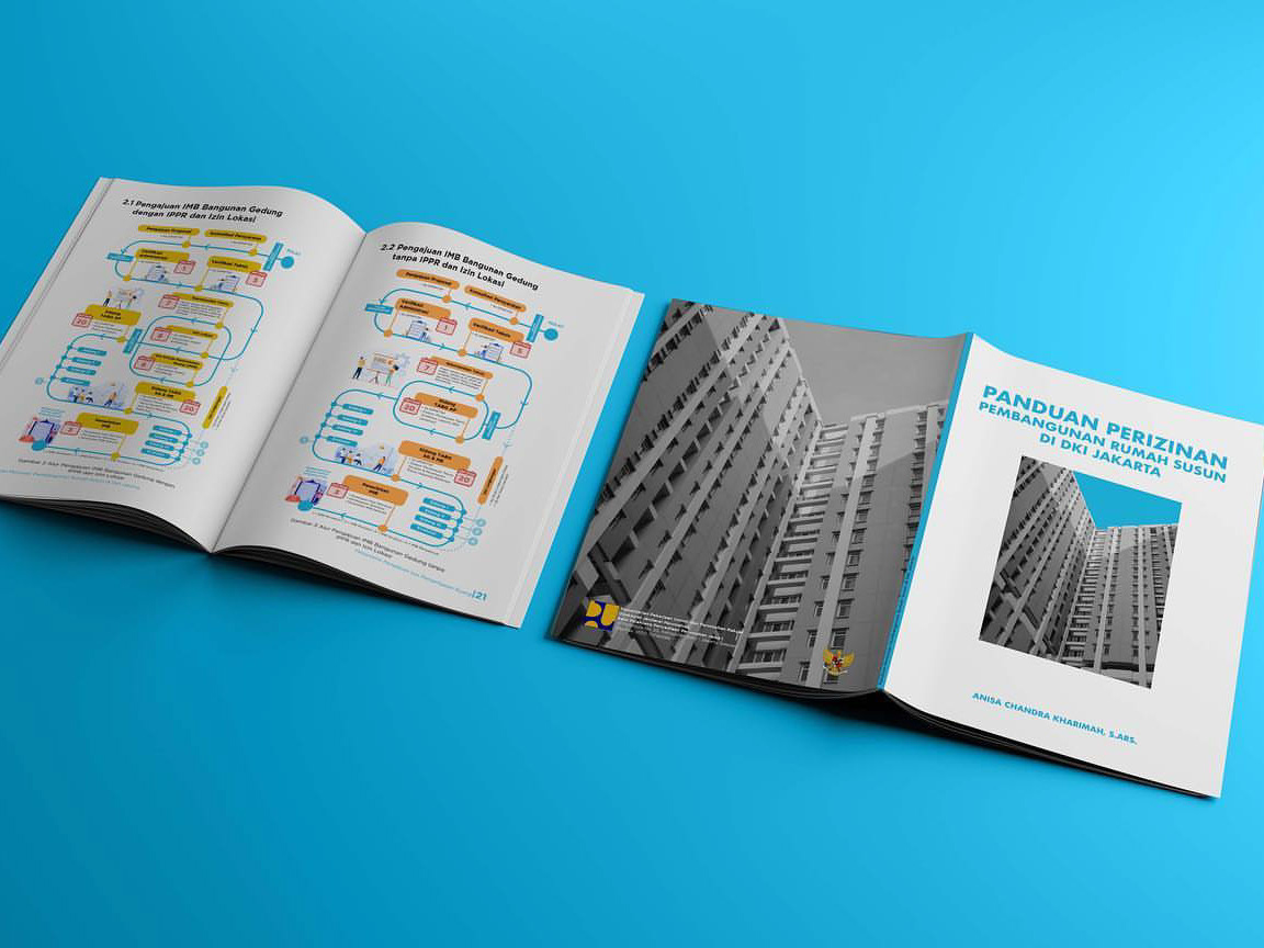
Jakarta Vertical-Housing Permits Handbook
2021
↑
Back to Top